Improving cross sales in Halifax banking
Exploring the online web application user experience
Role: UX design, graphic design.

Introduction
Halifax founded in 1853, initially as an investment and loan society then grew from a building society to a Bank in 1973 due to the advancement of technology in storing customer data.
I’ll attempt to redesign the account dashboard, landing page and consequent pages to improve the user experience and meet the highlighted business requirements.
“The positive impact of technology in the financial services sector in the United Kingdom is unprecedented globally.”
The benefits of this tremendous growth in recent times are:
Increased transparency
Efficient banking
Reduced costs
The vulnerable are provided with access to financial services.
Problem statement
Halifax is finding it difficult to understand the frequency at which adverts for cross-sales pop up and see where the most suitable area to place them is. How might we go about solving this problem?
User persona
Chinwo Uchukwu
Technology consultant at IBM.
A homeowner who lives in Birmingham, UK.
Loves a bit of retail therapy.
Aim
I hope to increase user retention and cross-sales for a range of products by exploring the time it takes to perform tasks that take too long. To increase user retention we will start by doing the following:
Helping users perform important tasks in fewer clicks.
Leverage personalisation methods.
Thanking our customers for choosing Halifax where possible without being too intrusive/annoying.
Key objectives
Increase user retention.
Increase cross-sale conversion across mobile and desktop devices.
E.g. cross-sale to credit cards/mortgages, current accounts or other products.
Research
Competitor analysis
Traditional banks (Google sheets)
Halifax home/ Dashboard
Annotated on Miro
NatWest home/ Dashboard
Annotated on Miro
HSBC home/ Dashboard
Annotated on Miro
Summary
NatWest utilises the middle content block well to display the most important information however they could make minor adjustments to their Z pattern with the use of a more noticeable P1 banner.
Being the largest corporation, HSBC has focused more on functionality rather than UI elements. Despite not being placed in the most visible positions they’ve incorporated two separate cross-sales onto one page — a very bold move.
Halifax is the only bank that has positioned a cross-sale on the dashboard. They have included this in a content block towards the bottom of the page, “Switch to us — (including accounts from other banks if you’re already a customer with e.g. savings accounts elsewhere) and get £100. Bonus!”
The most effective way to meet the key objectives in most instances is to strike the right balance between prominent features prompting a cross-sale, retain users without being intrusive, make UI elements minimal. One major issue is that all of these banks are not web responsive, this is an area worth exploring.
Red route analysis
This was a simple exercise that helped me understand the most frequently used features by existing customers.
Halifax top 3 most prominent features:
Viewing of accounts
Make and manage payments
Settings/profile dashboard
Zoom interview & user survey
(Qualitative data)
Potential users were interviewed via zoom the rest were asked questions on the phone whilst some filled out questionnaires via google forms. In total there were 14 participants.
Research questions:
How would you attempt to see what other products are available to you at Halifax?
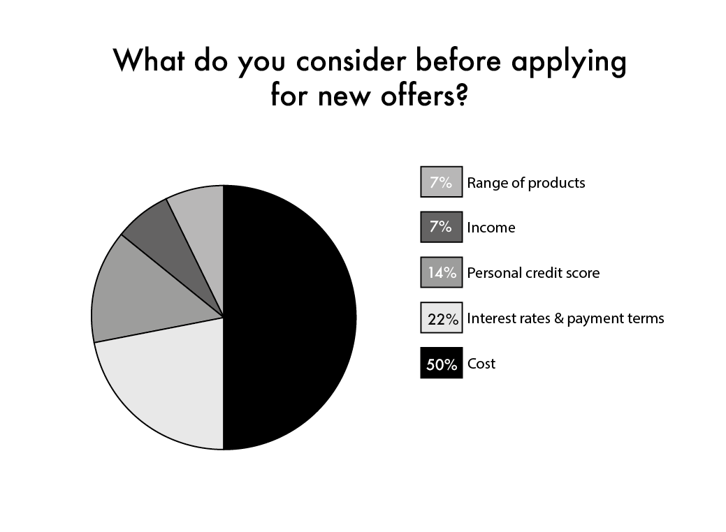
What considerations do you make before applying for financial products? (E.g Overdrafts, credit cards, mortgages, reward and savings accounts, loans and ISA’s etc).
What were your initial thoughts when you first joined Halifax?
What has convinced you to remain a loyal customer?
User survey
(Quantitive data)
The data gathered in question four indicates Halifax has a great portfolio of products to offer and value their customers as one person expressed that their mortgage experience has been phenomenal, “any issues I have is solved pretty quickly”. Another mentioned that the bank charges for her overdraft facility are very competitive.
Halifax doesn’t use aggressive sales techniques to promote new offers, most of their marketing is directed via online advertising or in-branch.
Most customers shop around for a bargain, money-savvy customers look at the interest rate/payments terms and 14% review their credit scores before making any new financial commitments. This an indication that customers will buy into something if its right for them.
Top three features in order
Managing and making payments
Upgrading accounts
Settings/ profile dashboard
Insights
The top three features that are preferred by customers is a possible indication of where the most suitable areas are to place a cross-sale whilst maintaining consistency in existing design processes/configurations.
Summary
The top three features that are preferred by customers is a possible indication of where the most suitable areas are to place a cross-sale whilst maintaining consistency in existing design processes/configurations.
Ideation phase (A)
Card sorting
This technique is used to generate ideas to form information architecture of products and services. Put simply this is how content is structured, organised and labelled it translate to what is shown on each mobile or desktop screen. I decided to do this alone but when run as a workshop it's far more effective.
Exercise guideline:
For users to group information that in an order understandable to them, these are called mental models.“Mental models = what the user believes about a given system”. Usually, how a person would expect the perfect system to work that incorporates seamless navigation and interactions.
Advantages: Is a straightforward exercise that can be performed by anyone, all you need are coloured post its and a pen.
Disadvantages: If you have too many cards it can become overwhelming
Summary
Focus on taking a deeper look at the account dashboard as this is where most interactions take place.
Ideation phase (B)
Mind mapping
Mind mapping is a fantastic method that UX designers pick out of their toolbox to get ideas flowing.
Advantages & disadvantages:
Great for idea generation, however too many options would perhaps make it difficult to find a solution that works.
Gitmind - Map 1
Gitmind - Map 2
Rationale
To exercise my divergent in my thinking skills by not ruling out random ideas.
To eventually narrow down my ideas by understanding what is realistically possible taking into consideration all known constraints. This could be cultural, time, budget, governing laws or policies of the country and industry etc.
Ideation summary
Card sorting
Participants had free reign to group information to their understanding rather than testing how logical Halifax’s existing information architecture, this encourages more room for innovation.
Most tasks happened in the accounts dashboard index suggesting a potential cross-sale goldmine.
Mind mapping
The mind mapping ideation technique has been a pleasure to do, eventually, I had a steady flow of ideas and at one point there were too many to pursue which got me a little excited, I have to admit, it’s always a pleasure to do.
The green nodes highlight five new possible areas to use for cross-sales, one of which is an existing hotspot for this strategy (account dashboard).
Snapshot of accounts
Virtual card switcher
Saving pots
Crypto wallet
Currency exchange
Wireframes
Low fidelity
I started with a mobile frame size in order to support web responsiveness. By taking this approach my intentions were that I would be accommodating a greater user base as we frequently hear how the elderly would be more familiar with banking using desktop platforms in comparison to mobile apps.
Mid fidelity
Moving into the next stage of the process I drew improved versions of my wireframes.
Proposed solution
Following the insights from my research, the possible outcomes are:
Use visual hierarchy & copy written in persuasive language to encourage customers to buy and remain loyal, this should result in increased revenue, sales may grow exponentially.
Creative use of visual design to make content blocks and CTA’s more prominent. This simply keeps customers engaged.
In turn, this will help meet business objectives and requirements implemented into a high-fidelity wireframe and app.
Learning from UX phase
What is there to learn from this process?
Gathering data can take longer than expected if not planned properly with attention to detail, do not assume everyone will understand the way you phrase your questions this is more so when catering to a wide range target audience.
Be patient to analyse and draw conclusions to your data insights to get the most appropriate solution. Using participants that actively bank with Halifax produces highly accurate results.
Conclusion
Be curious, empathetic and passionate about your work.
These are my key learnings:
Over time you will acquire a range of tools to help solve a problem but the greatest challenge is knowing what tool is best for a specific job.
Seek a balance between logic and emotion when building your UX skills.
Tools used:
Adobe Illustrator
Figma
Miro
Zoom
Sharpie, post-its and paper


